The First 48 Hours: Designing Activation Flows That Stick
TL;DR:
- Most apps lose 77% of users within 3 days—and the first 48 hours determine whether someone becomes a loyal user or a churn statistic.
- The key isn't more onboarding screens; it's reducing time-to-value, personalizing the path to your app's "aha moment," and using real-time signals to adapt.
- This guide breaks down what separates high-retention apps from the rest.
The brutal math of mobile app retention
Let's start with the numbers that keep product teams up at night:
| Timeframe | Average User Retention |
|---|---|
| Day 1 | 26.5% |
| Day 7 | 12.1% |
| Day 30 | 5.7% |
Source: Statista 2024 Mobile App Retention Benchmarks
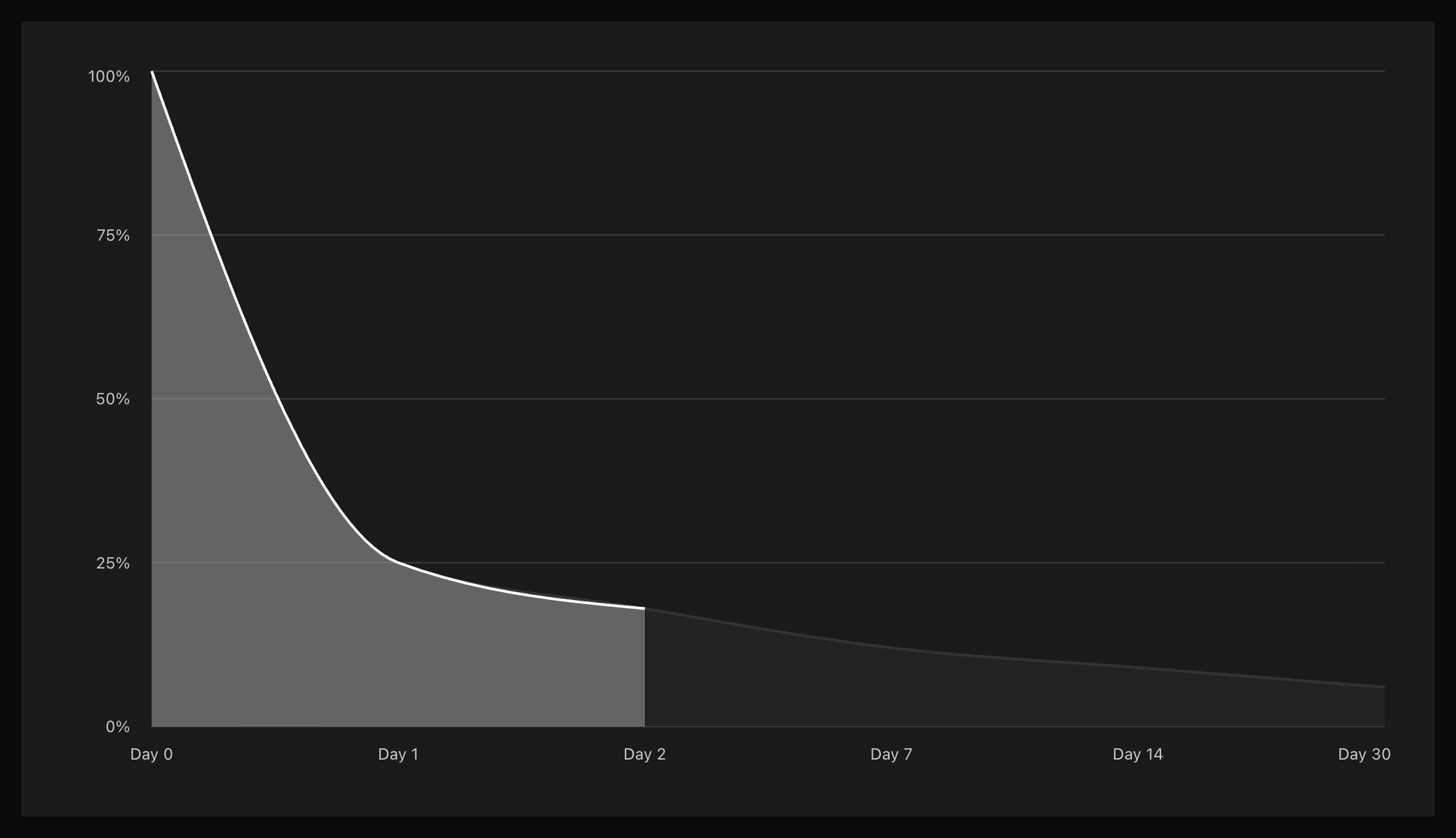
That means for every 1,000 users you acquire, only 57 will still be around a month later. And here's what most teams miss: the users you lose on Day 1 rarely come back. The first 48 hours aren't just important—they're existential.
The cost math is even more brutal. If you're paying $3-5 per install (and often much more for quality users), losing 75% of them before they experience any value means you're burning roughly $3 for every $1 of user acquisition that actually "sticks."
What separates the top 10% from everyone else
When you study apps with exceptional retention—think Duolingo, Spotify, or Cash App—patterns emerge. They don't have better marketing. They have better first sessions.
The "aha moment" isn't optional
Every sticky app has one. It's the moment a user experiences the core value, not just hears about it.
| App | Aha Moment |
|---|---|
| Duolingo | Completing first lesson and feeling smart |
| Spotify | Hearing a personalized playlist that "gets" you |
| Cash App | Successfully sending money to a friend |
| Headspace | Finishing a 3-minute meditation and feeling calmer |
The common thread: these moments are experiential, not informational. Users don't become activated by reading about value—they become activated by feeling it.
Speed kills (churn)
The fastest path wins. Every screen, every tap, every form field between install and aha moment is a potential exit point.
Here's a framework for auditing your activation flow:
Time to Value (TTV) = Time from first open to aha moment

For most apps:
- TTV < 60 seconds → Exceptional
- TTV 1-3 minutes → Good
- TTV 3-10 minutes → At risk
- TTV > 10 minutes → Bleeding users
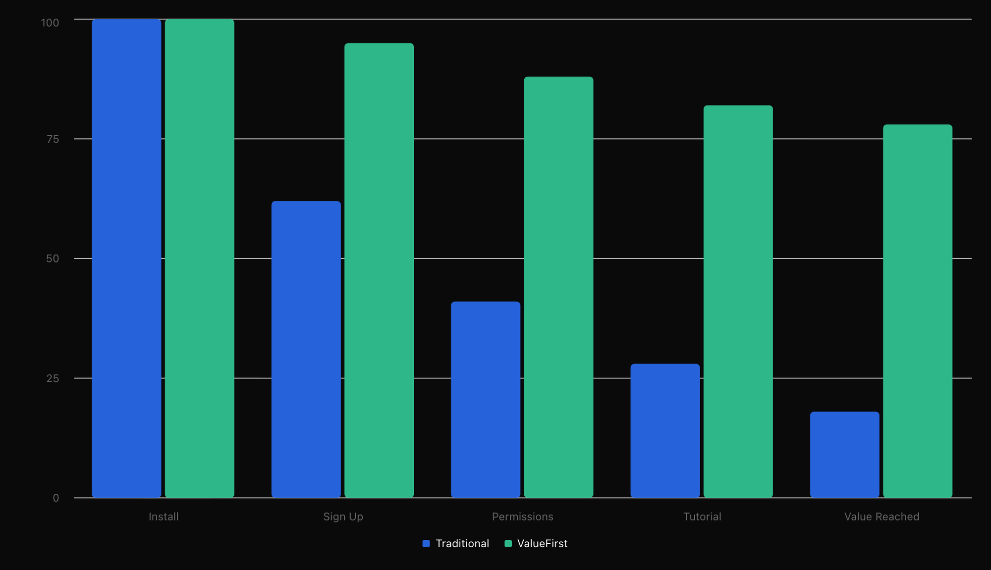
Map out every step in your current flow. For each step, ask: "Does this bring the user closer to the aha moment, or is it serving us?" Sign-up walls, permission requests, lengthy tutorials—these often serve the business, not the user.
The anatomy of a high-converting first session
1. Lead with value, not logistics
The instinct is to collect information first: sign up, set preferences, grant permissions. But every ask before value is a gamble.
Instead: Let users experience something valuable before you ask for anything. Duolingo lets you complete a full lesson before creating an account. Headspace drops you into a breathing exercise within 30 seconds. The signup comes after the hook.
2. Use progressive disclosure
Don't teach users everything. Teach them the one thing they need right now.
Heavy onboarding tutorials are a symptom of complex products trying to shortcut learning. But humans don't learn by watching—they learn by doing.
The pattern:
- Session 1: Teach one core action, help them succeed at it
- Session 2: Introduce one new capability, build on success
- Session 3: Expand their understanding based on what they've actually used
This also gives you signal. If a user never comes back for session 2, the 47 features you were going to explain wouldn't have saved them anyway.
3. Make the first win easy (and visible)
Completion triggers dopamine. Dopamine builds habits. Your job is to engineer an early, achievable win—and then celebrate it visibly.

Examples of engineered quick wins:
- Complete your profile → "You're all set up!"
- Add your first item → "Your collection has started"
- Finish the first level → Progress bar moves, badge unlocked
- Connect an account → "Now we can help you automatically"
The win should be real (tied to actual value), not manufactured (fake progress bars).
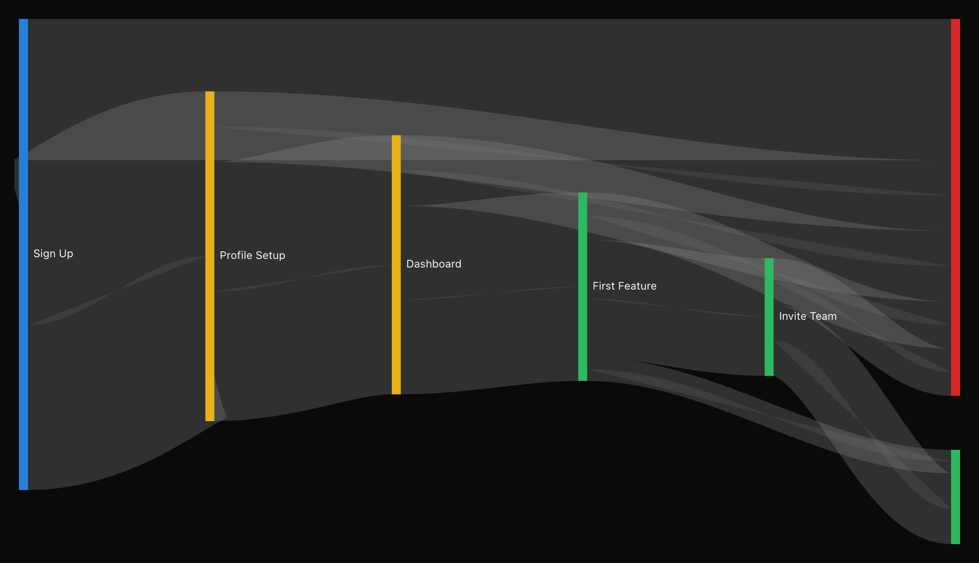
Where most activation flows break
After analyzing hundreds of onboarding flows, the failure modes cluster into predictable categories:
The Permission Gauntlet
Asking for notifications, location, camera, contacts, and health data—all before the user has any reason to trust you. Each permission prompt is a moment of friction and suspicion.
Better approach: Ask for permissions contextually, when the user is about to do something that requires them. "To send this to your friend, we'll need access to your contacts" converts far better than a wall of permissions on first launch.
The Sign-Up Wall
Requiring account creation to do anything meaningful. Some apps have valid reasons (multiplayer games, financial services). Most don't.
The data: Apps that delay sign-up until after demonstrating value see 30-50% higher activation rates. The key insight: once a user has invested time and experienced value, they have much more motivation to create an account to preserve that investment.
The Feature Tour
"Here's everything our app can do!" walks users through 8-12 screens of features they don't care about yet. Completion rates on these tours are typically under 40%—and those who skip retain at similar rates to those who complete them.
What this tells us: Feature tours are security blankets for product teams, not value for users.
Flying Blind
No instrumentation, no feedback loops, no idea where users are dropping off or why. You can't improve what you can't measure.
Minimum viable activation analytics:
- Funnel conversion at each step
- Time spent at each step
- Where users tap (rage taps = confusion)
- Completion rate of aha moment
- Correlation between activation events and D7 retention
Making activation adaptive
Here's where most guidance stops: "Optimize your onboarding!" But static optimization has a ceiling. The problem is that different users need different things.
A user who came from a TikTok ad with high intent needs a different experience than someone who stumbled across your app in the App Store. A power user of similar apps needs less hand-holding. A confused user who's tapping randomly needs more.
Signals you can read in real-time
Even in a first session, you have more information than you think:
| Signal | What It Suggests | Possible Adaptation |
|---|---|---|
| Acquisition source | Intent level, context | Skip/shorten intro for high-intent sources |
| Tap speed | Confidence level | Slow = more guidance, Fast = less friction |
| Hesitation patterns | Confusion points | Trigger contextual help |
| Time of day | Use context | Adjust tone, content |
| Device/OS | Technical sophistication | Adjust complexity |
| Scroll behavior | Engagement level | Long scrolls = interested, no scroll = lost |
From segments to individuals
Traditional approaches group users into segments and build flows for each. That's better than one-size-fits-all, but still limited. You're essentially building 3-5 static experiences instead of one.
The next evolution is treating each user as a segment of one—using real-time signals to dynamically adjust the experience. This isn't science fiction; it's what modern AI systems enable.
A user who's breezing through gets a shorter path to value. A user who seems confused gets additional context, without the confident user ever seeing it. A user who hesitates at a permission prompt gets a softer explanation of why it's needed.
The activation checklist
Before you ship your next onboarding iteration, pressure-test against these questions:
Value first:
- [ ] Can a user experience core value before signing up?
- [ ] What's our time-to-value? Is it under 2 minutes?
- [ ] Is the aha moment experiential or just informational?
Friction audit:
- [ ] How many taps between install and aha moment?
- [ ] Are we asking for permissions contextually or up front?
- [ ] What are we asking for that we don't need immediately?
Quick wins:
- [ ] What's the first completable action?
- [ ] Do we celebrate it visibly?
- [ ] Does it feel real or manufactured?
Measurement:
- [ ] Do we have funnel analytics for each onboarding step?
- [ ] Do we know our drop-off points?
- [ ] Have we correlated activation events to D7/D30 retention?
Personalization:
- [ ] Do we adapt based on acquisition source?
- [ ] Can we read behavioral signals and adjust in real-time?
- [ ] Are confident users getting a faster path?
Getting started
You don't need to rebuild your entire onboarding tomorrow. Start here:
-
Map your current flow. Every screen, every tap, every decision point. Time yourself going through it as a new user.
-
Identify your aha moment. What's the minimum experience that demonstrates core value? If you're not sure, survey retained users: "When did you know this app was for you?"
-
Find the biggest leak. Where's your largest drop-off between install and aha moment? That's your first optimization target.
-
Cut one thing. What's one screen, one form field, or one permission you can delay or remove? Ship it and measure.
-
Add one signal. Instrument one behavioral signal you're not currently tracking. Tap patterns, scroll depth, hesitation time—something that helps you understand user confidence.
The first 48 hours are a window that closes fast. Every improvement in activation rate compounds into retention, LTV, and ultimately, a business that doesn't need to outspend on acquisition to grow.
This is part of a series on mobile retention. Next up: A/B Testing Is Dead for Mobile—Here's What Replaces It